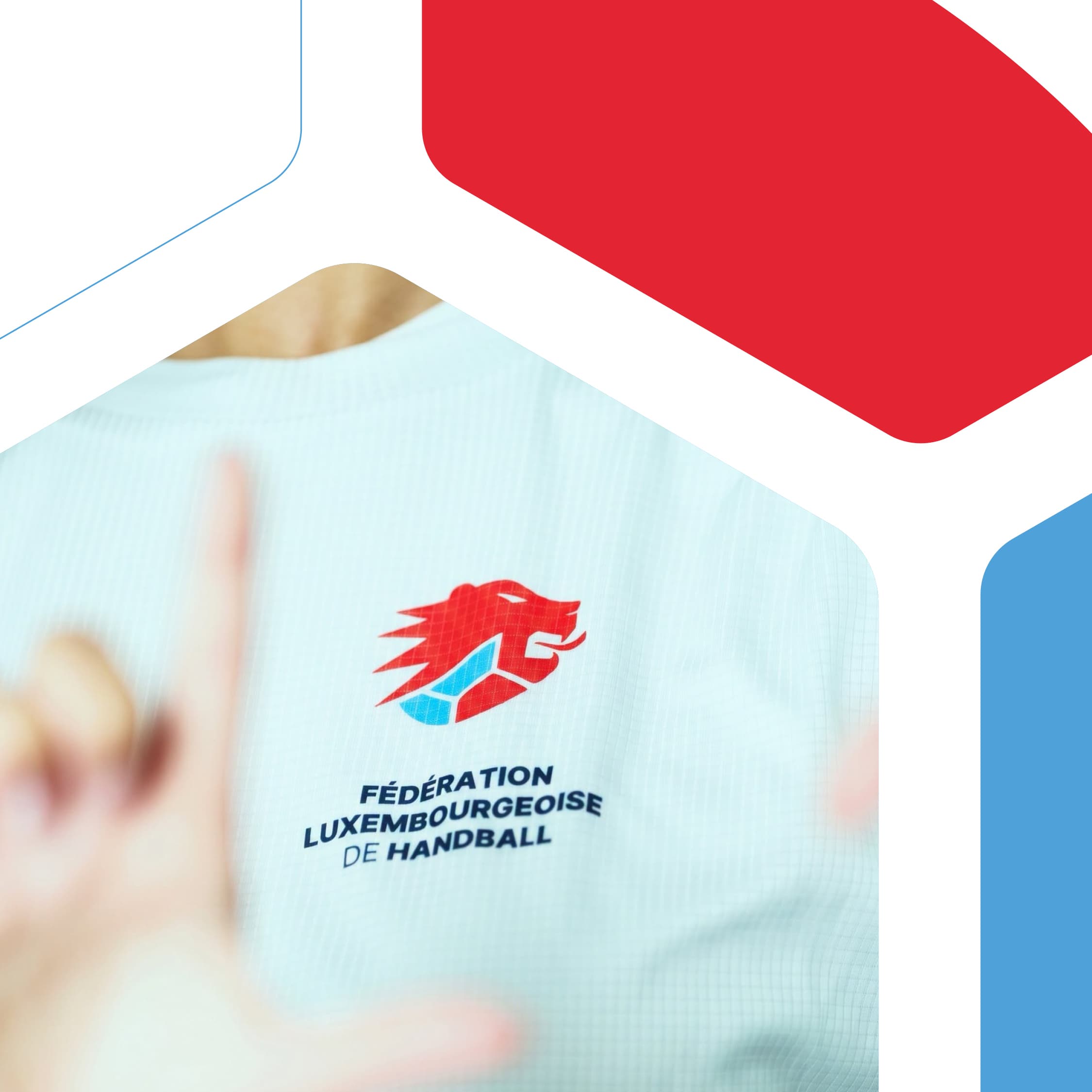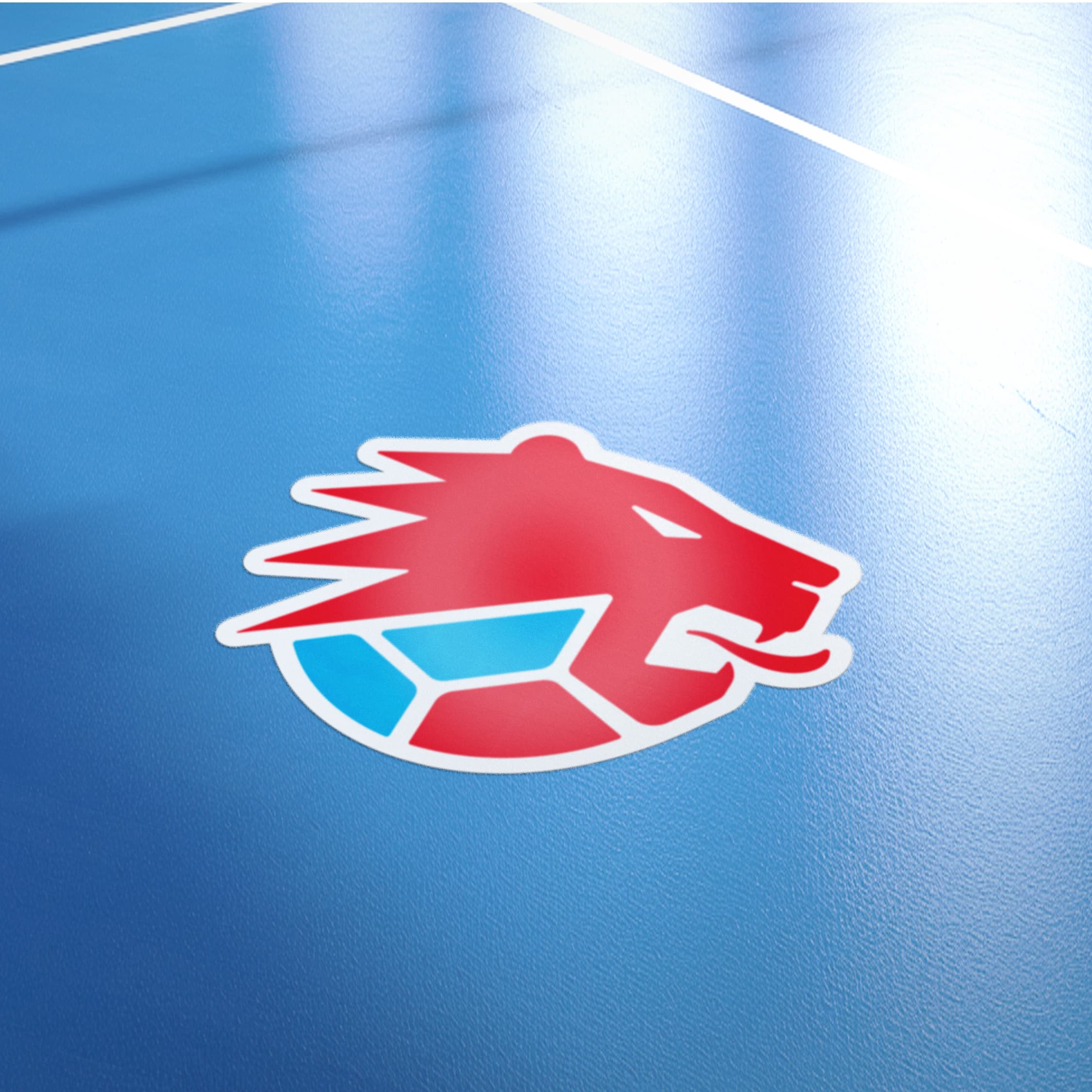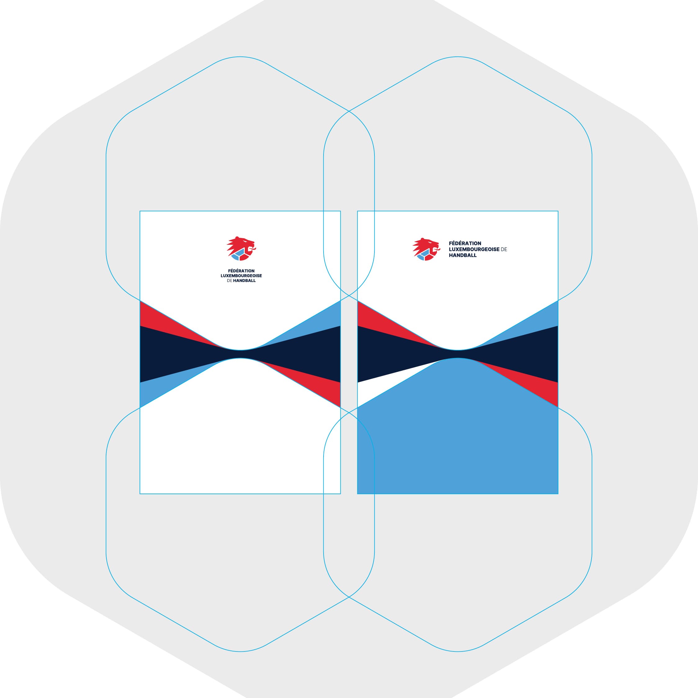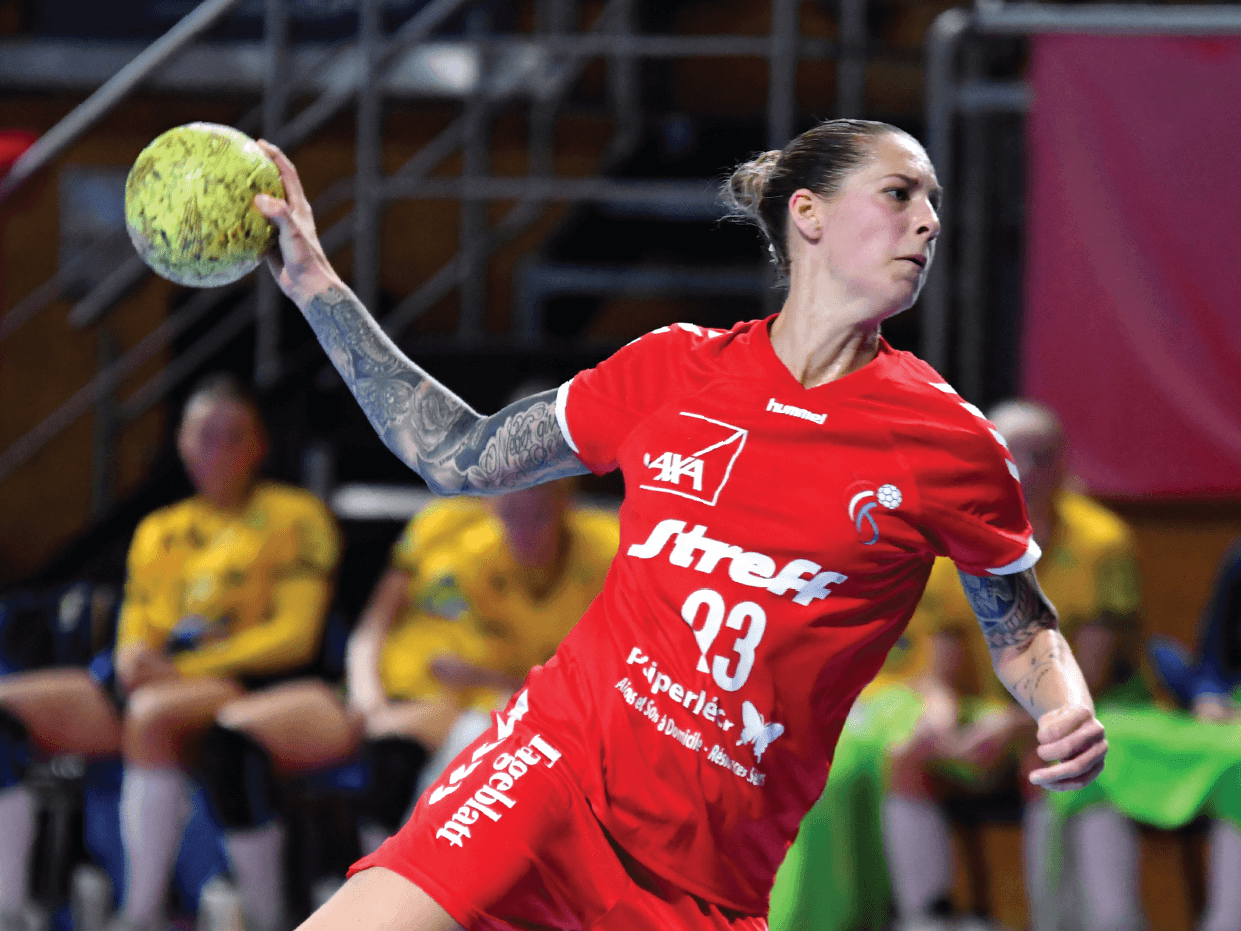
The Fédération Luxembourgeoise de Handball brings together the clubs, players and fans who keep the sport moving across the Grand Duchy. Handball is fast, physical and full of heart, and the federation wanted a logo with the same energy: something bold enough to sit on the front of a national team shirt, and flexible enough to work everywhere else, from the court floor to a letterhead.
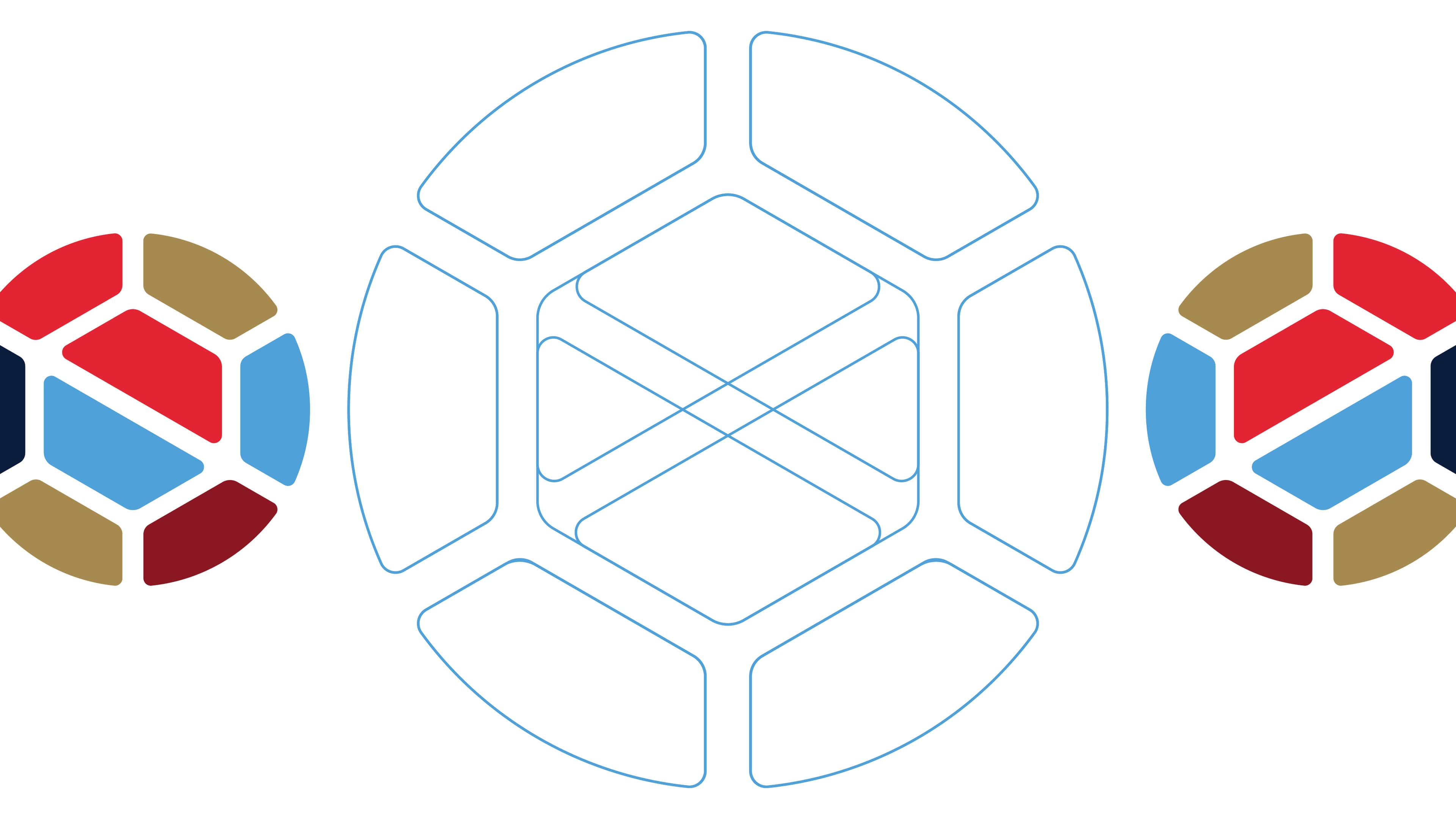
Our answer is a roaring lion, a nod to Luxembourg's most famous emblem, with a twist. Its body is a handball, built from the same rounded, hexagonal panels you see on the ball itself. Those panels carry the federation's colours in red and light blue, so the symbol is part animal, part equipment, and entirely handball. The mane streaks backward like a player at full sprint, giving the mark movement even when it stands still. We drew the whole system on a hexagonal grid, which keeps the proportions tight and gives the identity a quiet logic you can feel without noticing it.
Around the lion, we built a supporting identity: a refined palette of red, light blue and deep navy with touches of gold, horizontal and stacked logo versions for different formats, and a flowing graphic pattern that echoes the pace and curve of a ball in flight. From jerseys to court markings to documents, the new FLH identity is ready to be seen, worn and cheered for.
We are proud to have given Luxembourg handball a symbol as fierce as its players, and we are looking forward to seeing it on the court.