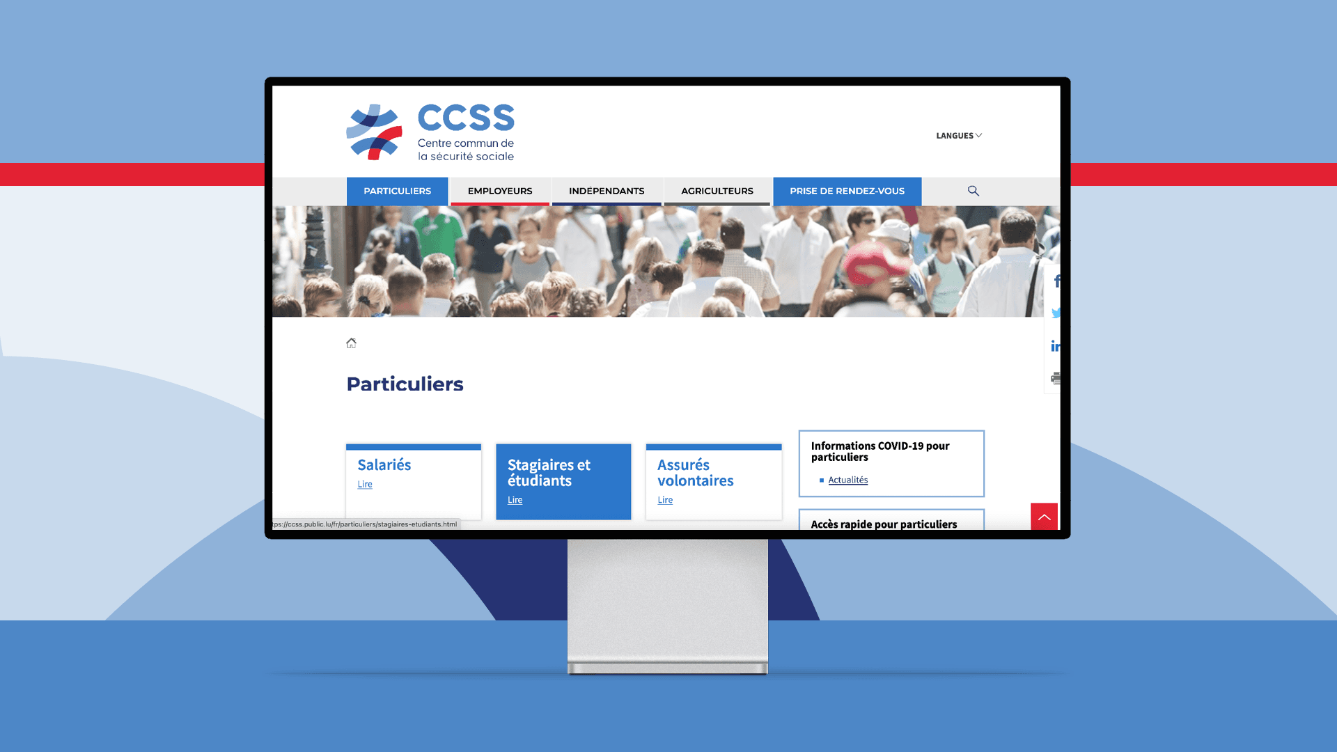
We’re happy to present another project we’ve been working on and which you might alreadyhave discovered in your mailbox. The Centre commun de la sécurité sociale, generally known as the shorter CCSS, tasked us with bringing their visual identity into the modern age. Key elements were a new logo with an easily distinguishable style that the customers would always recognise on their mail and documents. Another important point was to make the new logo more adaptable for the digital age with a stronger visual presence on websites for example.
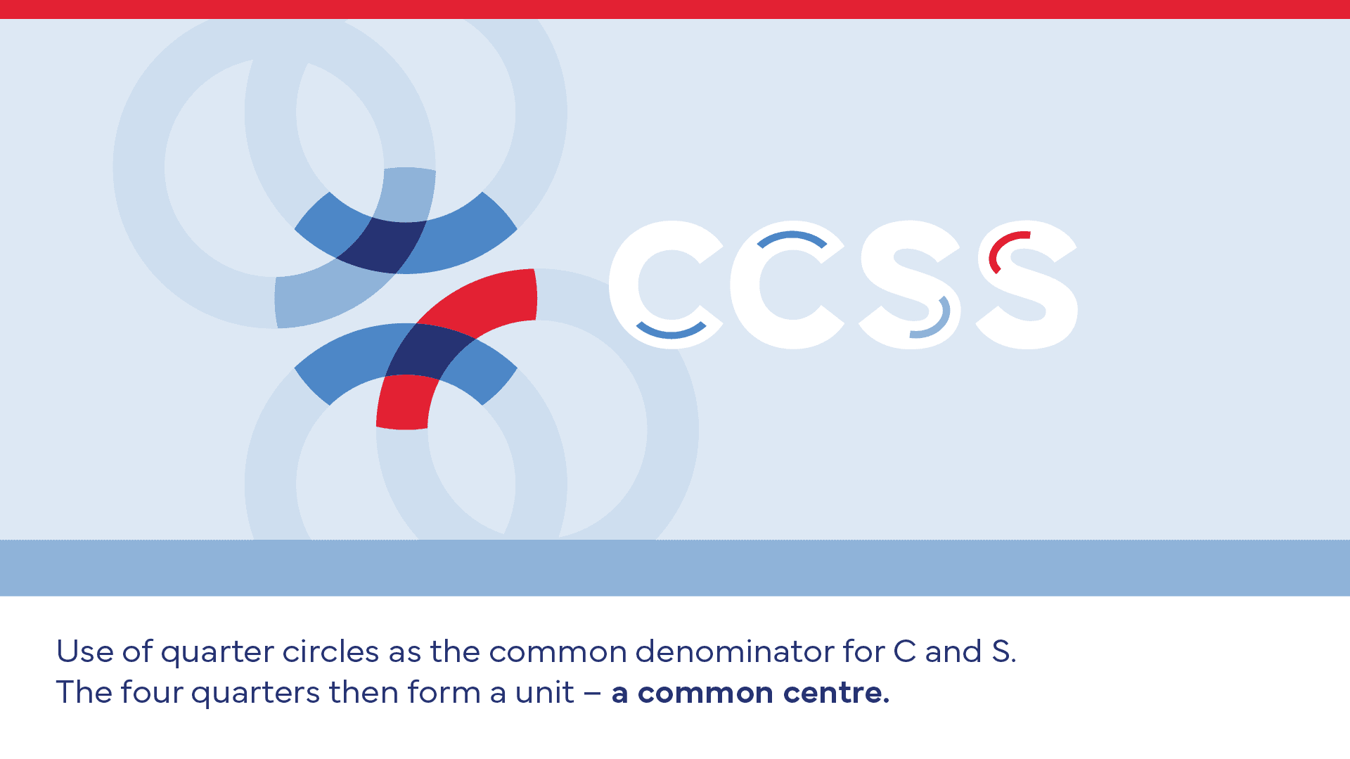
Our designers worked tirelessly to develop a strong, striking visual style, as well as a slight adaptation of the colour palette. Finally, four quarters of four circles were brought together to form the logo, representing the “centre commun” found in the name. The result is a visual identity that is consistent across the board and gives a purposeful look to the CCSS's communications, which are essential for anyone working in Luxembourg. 101 is proud to have worked with the CCSS on such an important project, which is bringing about lasting and meaningful change.
