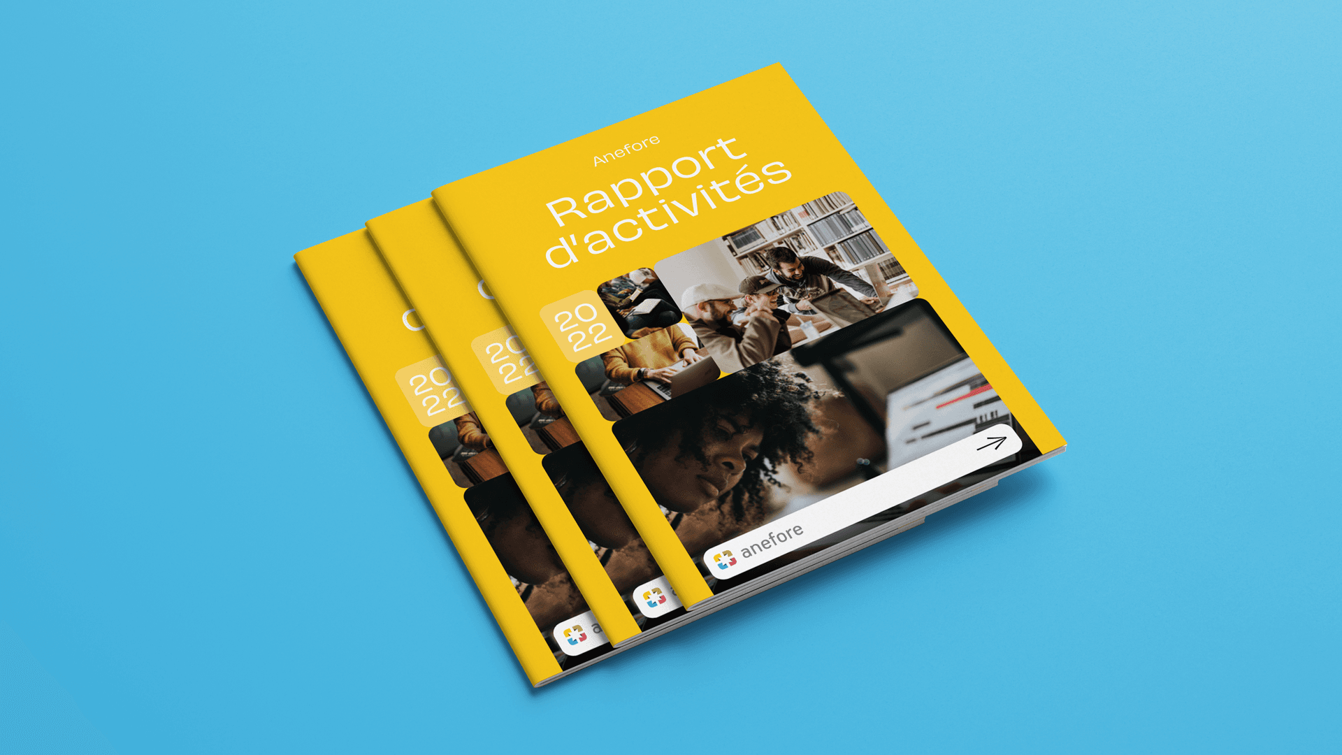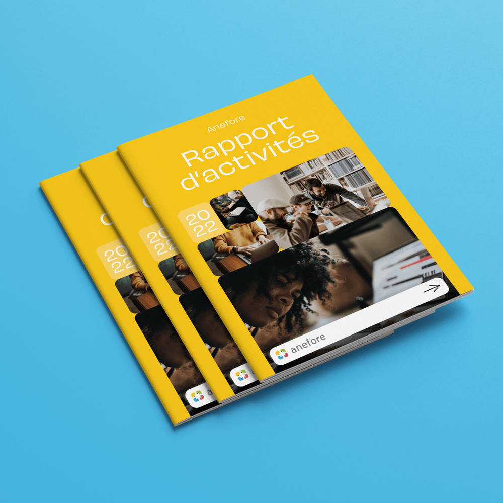
Our dynamic partnership with Anefore took a creative leap with the redesign of their 2022 Annual Report. Embracing the challenge, we aimed to breathe new life into the report, transforming it from a standard document into an engaging visual journey.
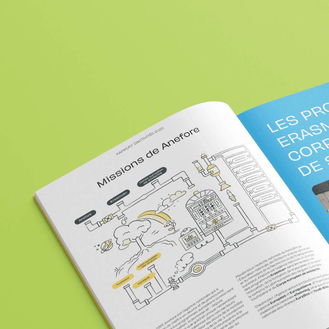
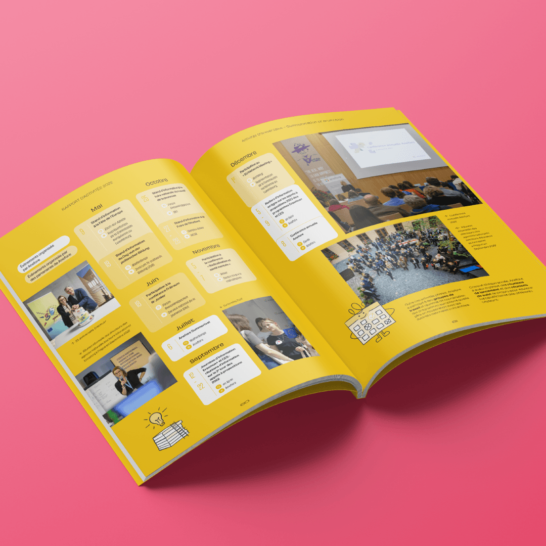
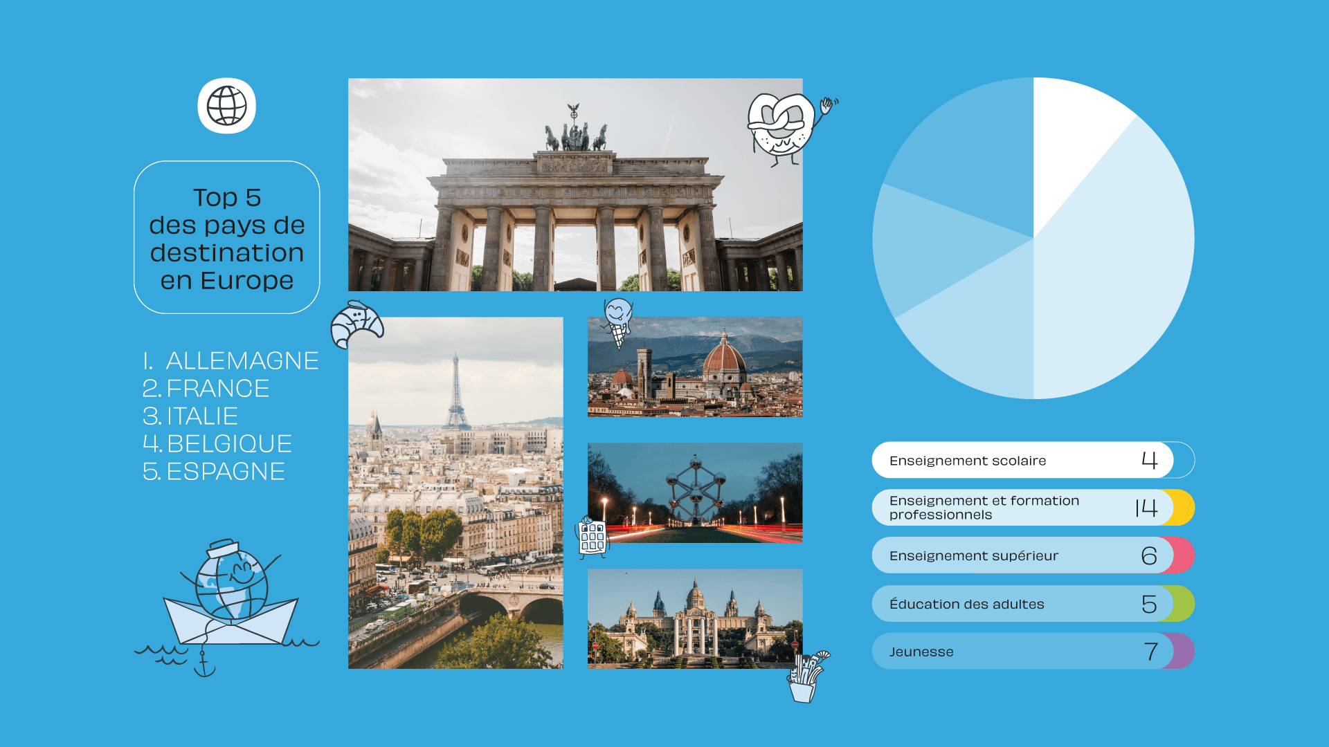
The revamp began with a complete overhaul of the report's graphic design. Our goal was to infuse the report with personality, making it not only more visually appealing but also more reader friendly. We introduced a vibrant colour palette and creative elements, transforming the report into an engaging, easy-to-read document. One of the key aspects of our redesign was making the wealth of information, facts, and statistics in the report more accessible. Through the use of clear, concise graphs and illustrations, we succeeded in breaking down complex data into easily digestible visuals, enhancing the overall reader experience.
Our use of bold colours and a coherent visual structure took the report to new heights, setting a new standard for how Anefore's information is presented. More than just a one-time design, we established a structure and graphical charter that paves the way for future reports, ensuring consistency and recognizability in Anefore's annual publications.
This project with Anefore showcases our commitment to blending functionality with artistic flair, and we are excited to continue pushing the boundaries of design in our ongoing collaboration.
